
✦ Project Overview
Create and publish a website that showcases the best startup founders in Miami, Florida in less than 2 weeks.
The client wanted a [Home] page that displays startup founders’ info and an [About] page that explains Miami Founders and its creator.
Miami Founders is a gateway for the world's top investors and enterprises to meet the finest innovators pushing boundaries and turning Miami into a global force.
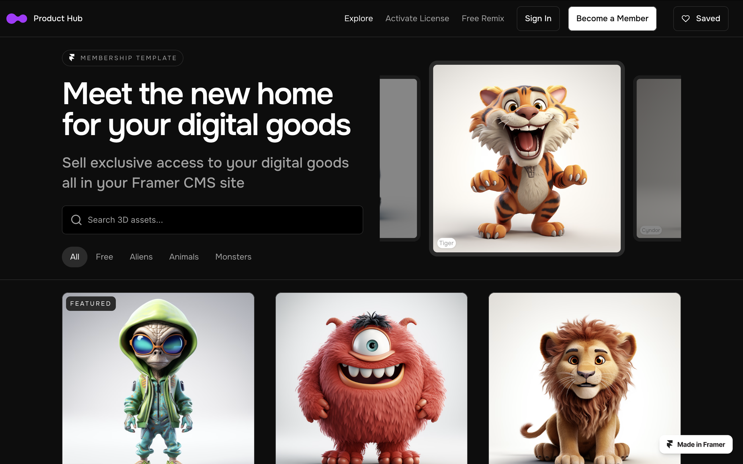
This website was created in Figma and published in Framer. The project took 15 hours to complete.
✦ Project Goals
✦ Create a website that showcases Miami’s top founders
✦ Publish the website in less than 2 weeks
✦ Include links to startup founders’ websites & social medias
✦ Explain the project and its founder
✦ Must be elegant and ‘Miami-esque’
✦ TARGET AUDIENCE
Investors, entrepreneurs, enterprises, and partners looking to tap into the energy of Miami’s top startups.
✦ GUIDELINES
The website should have a [Home] page that uses the website below as a reference. There should also be an [About] page that explains the project’s purpose and its founder.
Template Site
The theme should be elegant and ‘Miami-esque.’ The client provided some examples websites like Poolsuite, Vacation®, The Surf Club, and Bas Fisher Invitational. The goal is to create a website that stands along these examples.

Vacation®

Poolsuite

The Surf Club

Bas Fisher Invitational
✦ IDEATION
For the [Home] page, the client wanted to replicate the template site’s photo carousel and grid layout so I started with a similar format for the hero section and body. The carousel will cycle between a handful of founders’ headshots. The body will list each founder’s details (photo, name, job title, company, description, social media links) in alphabetical order by last name.
I drew inspiration for the [About] page from the many creative free form layouts in the Bas Fisher Invitation website. Since this page consists of mostly copy and only one image, I wanted it to be eye-catching by making it asymmetrical and unstructured.
I transferred these sketches into Figma to create lo-fi digital wireframes.
Sketches

LO-FI WIREFRAMES

After turning the sketches into wireframes, I sent them to the client for discussion.
We went over design influences and ideas for the style guide and hi-fi mockups. The client emphasized keeping it simple so it could be published within the timeframe.
As I moved onto higher fidelity designs, the client sent me a spreadsheet with each founders’ info, including portrait photos and links to their social media, to populate the hi-fi mockups.
STYLE GUIDE (V1)


The client wanted to stick with a super simple color scheme to aid in publishing time. We determined that white, off white, and black were the easiest colors to work with for this first go, and that it could be revisited later.
I chose typefaces that were similar to The Surf Club and Bas Fisher Invitational websites to replicate that Miami-esque look and feel.
Voltaire is used for the navigation and H1, while Roboto Mono is used for the body. The other headings are Roboto Condensed, as it serves as a good middle ground for the two.
HI-FI Mockups (v1)

I replaced the placeholder text with founder names, headshots, social links, and descriptions. I added some photos in the [About] page to see so that it wasn’t only text.
At this stage, I met with the client to discuss the progress. We decided that the photos seemed out of place and didn’t add anything extra so we opted to remove them. It was also difficult to make each startup description the same length so the text blocks varied in size. Additionally, I thought the 3-column design was a little crowded so we decided to change it to a single column.
Lastly, the carousel felt like a B2B SaaS website rather than Miami-esque, so we wanted to try something new.
HI-FI Mockups (V2)

In this iteration, we moved away from Voltaire and used ITC Garamond for a more polished look. It looked more Miami-esque while Voltaire didn’t fully match the aesthetic.
The client originally wanted an image carousel because they wanted to showcase founders at the top. This new version keeps that in mind while adding color and looking less like a B2B SaaS website.
I changed the format of the founders list to a single column because three (and two) were too crowded and the asymmetry looked off.
For the [About] page, I moved some of the text elements around and moved the bio to the right side because it felt more balanced.
STYLE GUIDE (V2)


